
Data visualization has revolutionized the way we perceive and understand information. It has breathed life into plain numbers, making them more informative and easier to understand. One such powerful visualization tool is the area chart. In this article, we will explore everything about this fascinating tool, from its basics to its real-world applications. Keep reading to delve into the world of area charts.
The Importance of Area Charts in Business Analysis
In a world where data is king, deciphering patterns and extracting insights from vast quantities of information is critical. Area charts offer an effective way to accomplish this. By displaying quantitative data graphically, these tools aid in identifying trends and correlations.
An area chart offers a visual representation of data over time. It is particularly helpful in comparing two or more categories. Using it, decision-makers can see how these categories overlap or stand apart. Due to their inherent simplicity and depth of information, area charts hold an esteemed position in business analysis. They are commonly used in finance for stock market analysis, sales forecasting, and budget planning.
What makes these charts particularly useful is their ability to display volume. This makes them a go-to tool for understanding overall trends rather than pinpointing episodic events. When used wisely, an area chart can effectively communicate big data in a simple, aesthetic, and understandable manner.
Understanding the Basic Structure of Area Charts
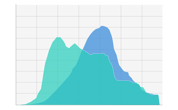
To make effective use of area charts, one must first understand their basic structure. While they might appear complex at a glance, their structure is relatively simple. An area chart consists of x and y axes, just like line graphs. Its uniqueness lies in the interlinking line segments that create a shape between the line and the x-axis, which is then filled with color or shading.
The vertical y-axis usually represents the quantity or frequency of the data. In contrast, the horizontal x-axis often represents time, though it could represent other sequential measurements as well. Additionally, an area chart could be stacked, where different categories are represented by different colors that are stacked onto each other. It helps to display the part-to-whole relationships and how each category contributes to the total.
The Process of Gleaning Insights from Area Charts

Area charts are particularly good at emphasizing the magnitude of change over time. This aspect can be used to identify trends or patterns that emerge over a given period.
In stacked area charts, the total height of the chart at any given point on the x-axis reflects the total value of the data at that point. Changes in color sections indicate changes in the contribution of different categories over time. Thus, they provide a comprehensive view of a data component’s growth or decline relative to the others.
Ultimately, the most significant advantage of area charts is their visual simplicity, which helps reduce the cognitive load on viewers, allowing trends and variations in the data to be discerned intuitively.
Using Area Charts to Drive Business Decisions
Let’s imagine a retail company that has been documenting its quarterly sales of different product categories over the past five years. A stacked area chart depicting this data would show the changes in total sales while highlighting which product categories most contributed to those changes.
If, over time, a formerly minuscule category starts to take up more space on the chart, it could indicate a trend for investment. Conversely, if a previously dominant category starts to shrink, it might be an alarm bell for a need to reassess strategy.
A success story can be seen in how the tech giant Microsoft used area charts to identify priority areas for growth. They attributed increases in revenue to specific divisions, helping to shape their future business strategies.
Ultimately, area charts go beyond presenting statistical data; they offer businesses an opportunity to make informed, strategic decisions based on trends and forecasts.
Overall, area charts are an under-acknowledged data visualization tool in business data analysis. They provide a simplified yet in-depth view of business metrics over time, serving as guides for strategic, data-driven decision-making. Armed with these insights, businesses can navigate with confidence in their journey toward growth and success.
Read More:
Tips for launching a successful startup
