
One of the most critical elements to achieving your brand is to understand your audience. Feminine branding is when your brand’s main target is women, you may need to create designs that are more on the feminine side. For the female audience, the feminine design is more effective and appealing.
Is it possible to create a design that is naturally beautiful to the female eye? What are the factors you need to consider when making a feminine design? If you apply the correct elements to it, your designs will be able to become successful.
This article will provide elements you need to consider when designing a female brand. Remember that each element can change depending on the target market’s culture, age, and lifestyle.
Use Handwritten Typography
Adding handwritten fonts can have a more feminine touch to any design. You can use simple texts or titles from books, articles, or songs. If you want a more personal touch, you can make your original message.
You need to remember to be careful with the texts you’re putting in. There could be some offensive or not ideal for certain ages. For instance, young girls should have softer, kinder messages in the text. On the other hand, older women would prefer messages that portray their emotions or are optimistic.
When using handwritten fonts, you can either use a pen and drawing tablets to write your writing style or download fonts on the internet. You’ll find tons of available fonts that you can use for your typography designs.
Choose Bright Colors
When it comes to feminine brands, colors are probably the most common concept. We usually relate pink to women. However, that’s not your only option when it comes to colors because there are plenty of them.
Shades that you need to avoid are neutral ones, such as browns and grays. Although some women like the color, the majority of them don’t prefer it. If you’re going to choose between green and blue, we recommend going for green as more women prefer it.
One thing you should remember is to limit your color palette. Use softer tones and bright colors because they are the top choices when it comes to feminine concepts.
Pastels are a good place to start if you’re not sure what to do first. Slowly adjust the color depending on your target market and the trend.
Include Floral Visual Elements
Nature is a famous feminine idea across cultures, and floral images or patterns are associated with it. This will make it easier for you to connect to your female audiences as you create illustrations showing floral elements.
One thing you need to be careful of is making too many floral designs. We recommend adding one, add a little more if you think there’s enough space for the design.
The best thing to do is to use bright colors when making them. Just remember to be careful that the colors match well. You don’t want the colors to fight; instead, you’re looking for a harmonious effect.
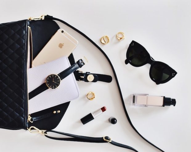
Use Stock Photography
Adding photos to the design gives a more feminine touch. The only problem is the type of photo you would use. This will depend again on your target market.
For instance, if your audience loves baby animals, you can add a photo of them. They’d probably get a warm, fuzzy reaction as they see a cute image. You can also use pictures of babies for your parent audiences.
On the other hand, if your target is more on the business side, you should avoid using photos of babies or animals. Instead, you can use a photo of a successful businesswoman. If other brands are using this photo, you can use a photo of a woman that shows she’s in charge.
When looking for a photo, it’s best to use the subjects that are looking at the camera as it builds a connection to women. They can build an almost-emotional connection with the subject.
Use a Personal Writing Style
The copy on your designs can affect when connecting with female audiences. The graphics in it can catch attention, but if the tone isn’t pleasing to females, they will get disconnected right away.
Use a friendlier approach. Avoid using contractions and complicated words. Instead, we recommend keeping the texts simple, making them less formal.
You can use personal messages or put in a female’s idea to represent what’s on their mind. Add a color that would bring more meaning to it because colors can change the way we think. This method gives a personal touch and allows them to become more connected to the brand.
Final Thoughts
Designing a feminine brand can be difficult because there are various elements to consider. You need to ensure that the color, design, photo, and other things in it catch the attention of women, and find the brand attractive. Once you’ve built a name for your feminine brand, your brand will get more exposure, allowing your business to grow.
Read More:
The Ultimate guide to brand awareness
